Look Settings
VIEW ▸ Look Settings opens the dialog that tunes the current look. Everything in it previews live on the canvas as you change it; OK commits the whole session as one undo step, and Cancel puts everything back.
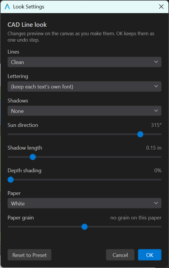
Lines
The line treatment is the hand every stroke on the sheet is drawn with. It is separate from the stroke style (the dash pattern), which is kept.
| Treatment | Character |
|---|---|
| Clean | Exact geometry. What CAD Line, Illustrative and Realistic use. |
| Ink | A confident pen: slight wobble, rounded ends, a little weight variation. |
| Sketch | Loose: visible wobble, corner overshoot, several passes. |
| Marker | Broad felt tip: heavier, soft-edged, a little bleed. |
| Pencil | Graphite: grainy, lighter, doubled strokes. |
Treatments are consistent from screen to export.
Lettering
The font every text object and leader draws in. Three hand-lettering faces ship with the application and travel with it, so a document lettered in one of them renders correctly on any machine; installed script faces are offered alongside them.
To keep one label in its own font regardless of the look, select it and check Keep this font in every look on the Text or Leader tab. See Text & Leaders.
Shadows and Sun
| Control | What it does |
|---|---|
| Shadows | None, Hard (a crisp offset silhouette, as in marker and ink renderings) or Soft (a blurred penumbra, for watercolor and realistic). |
| Sun direction | The direction shadows fall, in degrees. One sun for the whole sheet, so trees, buildings and shrubs all agree. |
| Shadow length | The offset distance, in inches on the sheet. The same value reads the same on a millimeter document. |
| Sun altitude | How high the sun sits above the horizon, in degrees. It sets the shadows of things that have a Height (below; trees, shrubs, furniture, people and vehicles have one by default): the shadow is the height divided by the tangent of the altitude, so at 45 degrees a 30 ft building throws 30 ft of shadow and at 30 degrees about 52 ft. Raise it for shorter shadows everywhere. |
| Depth shading | 0 to 1. Gives surfaces and canopies form, shaded on the side away from the sun. In Watercolor it is the pooling instead: how strongly pigment gathers at the edge of each wash. In Marker it is the second coat: how dark the band along the shade side of each area goes. In Colored Pencil it is pressure: how hard the pencil goes over the shade side of each area. Realistic, Watercolor, Marker and Colored Pencil ship with it on; the other looks start flat. |
Things that stand up off the plan cast look shadows: trees, shrubs, site furniture, people, vehicles and buildings. Flat things such as paving, markings and utility symbols do not. Nor does anything in paper space on a drawing exported from a layout, such as the plant legend, the title block and the notes: only what the viewports show stands in the sun. A shadow set on a style still draws there. A shadow you set on a specific style always wins over the look's sun, so one object can be treated differently without turning the global sun off.
A layer's Height above ground (at the top of the Shadow tab of its style, in drawing units, with a per-object override) replaces the fixed shadow length for that layer: the outline is swept along the sun by the length the height and the sun altitude give, fading with distance, so a 30 ft building and a 6 ft fence on the same sheet throw shadows in proportion. A shape or circle with a height stands up whatever its material: a filled outline as a solid, an unfilled outline or an open line as a wall along it (a screen wall, a fence, a round planter wall), whose shadow is the strip it throws, the ground inside left in sun.
Left at 0, a library symbol stands at a height in keeping with its drawn size and its kind, so a planting plan throws believable shadows before anyone types a height: a tree about as tall as its canopy is wide, a cedar taller and a spreading oak lower, shrubs, boulders, furniture and cars lower still, a standing person taller than they are wide. The Shadow tab of a selected symbol says the height it is using. Type a height on the layer or on selected objects to change it; anything else left at 0 takes the look's fixed offset.
In a viewport with a Civil 3D surface (see the Terrain tab) things with a height stand on the ground under them, and the height is measured from there. Their shadows end where the sun's rays meet the surface rather than on flat ground: longer down a bank or off the top of a retaining wall, shorter up a slope, and stopped by a wall face they run into. Beside a 5 ft retaining wall a 29 ft tree on the upper terrace throws 40 ft of shadow off it at a 40 degree sun instead of 34, and with the sun behind it a tree on the low side throws 41 ft at 30 degrees instead of 50, its shadow ending on the terrace. All the look's shadows (a surface's own, the trees', the buildings') draw as one, with or without a surface: where they overlap they merge rather than darken each other, so a building drawn in several pieces throws one even shadow, and none falls over a tree's canopy or a roof.
A tree symbol with a height is a crown held up on a trunk. Its crown throws its own outline out along the sun from the crown's height, stretched longer as the sun gets lower, and the trunk throws a thin line from the foot of the tree to it, so a tall tree's shadow stays joined to the tree the way it does on the ground. Shrubs, boulders and furniture sit on the ground and throw the same kind of shadow starting under themselves.
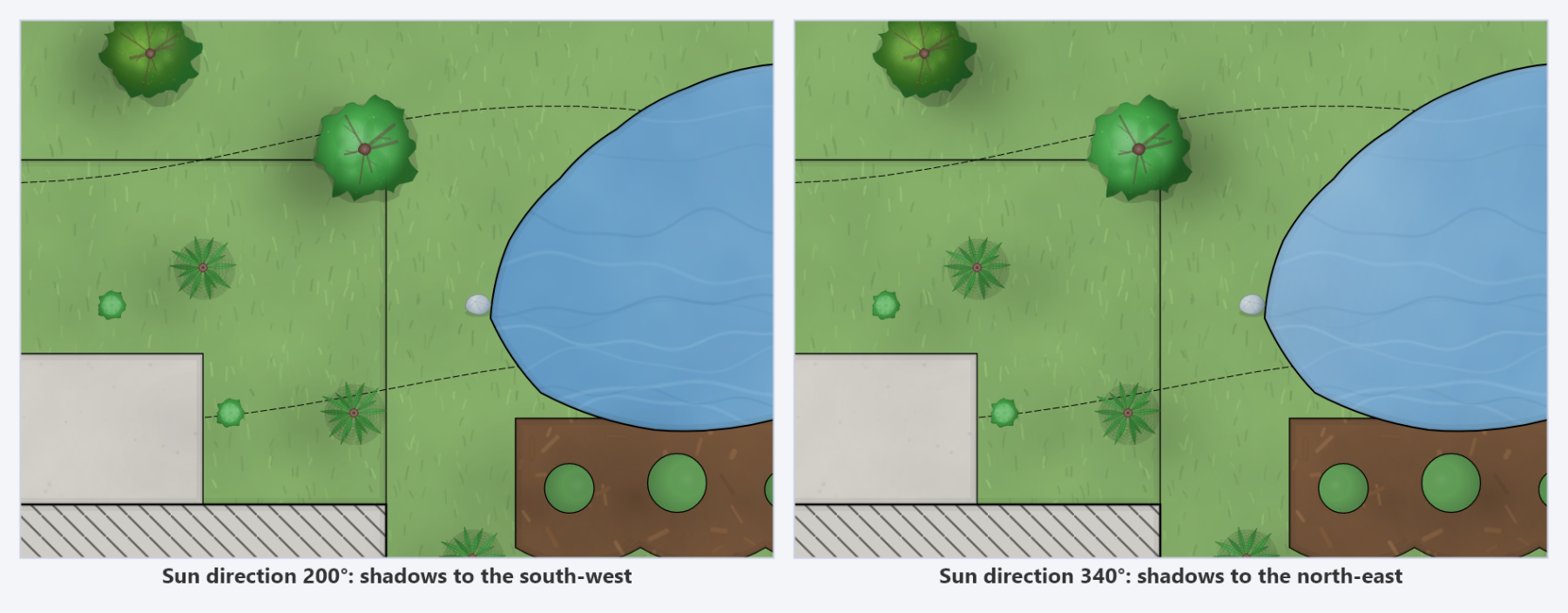
Depth shading takes its light direction from the sun, so shading and shadows are consistent with one another; move the sun and both follow.
Sun by Date and Time
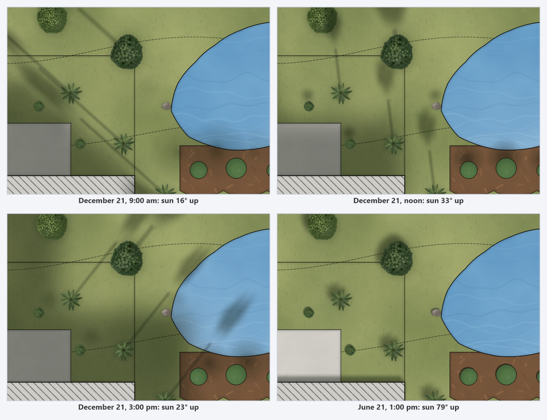
Check Place the sun by date and time, on the right of the dialog, to set the sun from the site, the day of the year and the time of day instead of by hand. It is an alternative to the hand-set sun, not a replacement: while it is on, the Sun direction and Sun altitude on the left are greyed and show where it has put the sun, and turning it off gives you your own values back. It belongs to the drawing rather than the look, so it stays when you switch looks, and Reset to Preset leaves it alone.
| Control | What it does |
|---|---|
| Latitude, Longitude | The site, in degrees; west and south are negative (Dallas is 32.78, -96.80). When the drawing was exported from AutoCAD with a coordinate system (a geographic location, or a Civil 3D drawing zone), they are filled in from it and the note names the system. Typing over them overrides the drawing, and Use the drawing's location goes back. |
| North arrow on the sheet | Shown when the drawing has no coordinate system. North is taken to be the drawing's Y axis, turned by the viewport's rotation, which is right for a plan drawn north-up. If yours is not, type where the plan's north arrow points, in degrees clockwise from straight up. |
| Date | Any day of the year. The marks under the slider are the equinoxes and solstices; click one to go to it. The summer solstice has the year's highest sun and the winter solstice its lowest (a site south of the equator swaps the labels). |
| Time of day | Local clock time, from sunrise to sunset on that date. Both times are shown under the slider. |
| Clock | The clock's offset from UTC, estimated from the longitude (Central Standard Time is -6, Eastern -5, Pacific -8), and Daylight saving time for summer clock time. |
The dial shows the sky over the plan the way the sheet shows it: north where the plan's north is, the day's path of the sun, the sun itself, and the shadow it throws. Beside it, the readout gives the sun's height and bearing, how many times their height shadows run, and the day's highest sun.
Each viewport gets its own shadow direction, since true north turns with a viewport's rotation. Things with a height cast from the sun's real altitude; things without one keep the look's shadow length at the hand-set altitude, lengthening as the sun sinks and shortening as it climbs. Below the horizon nothing casts, and a sun just above it is held a little higher, since its shadows would run off the sheet. The look's Shadows setting still decides whether and how shadows draw. A Civil 3D surface's relief keeps its own light unless its Light is set to Look's sun on the Terrain tab; then this sun lights the ground as well, and the relief follows it as you move it. The surface's own shadows (its retaining walls and banks) always fall from the look's sun, hand-set or placed by date.
Paper
| Control | What it does |
|---|---|
| Paper | None, White, Trace, Vellum, Watercolor Paper or Kraft. Each has its own tone and grain, from the faint tooth of trace to the heavy texture of kraft. |
| Paper grain | 0 to 2, scaling the paper's own grain strength. 0 is smooth, 1 is the paper's default, and above 1 exaggerates it. |
A layer set to Render as plain CAD still sits on the same paper as everything else.
Materials...
Materials... opens the material table for the current look: the texture, tile scale, strength and default color every material is drawn with. It is the one control in this dialog that reaches beyond the open document; the table is an office setting, stored per user and shared by every drawing on the machine. See Materials for what the built-in table does and how to change it.
Reset to Preset
Reset to Preset returns every setting on the left to the current look's defaults, the fastest way back after experimenting. It resets the look's settings only; nothing about your layers, colors or materials is touched, and the sun's site, date and time are kept.
Small adjustments that carry a sheet
- Shorten the shadows. The default reads well at typical site scales, but a dense urban plan usually wants less.
- Turn the sun so shadows fall away from the areas you want read, not across the labels.
- Back the grain off for a plan that will be printed small; paper texture that looks right at full size can muddy a half-size print.
- Try Ink treatment with a non-ink look. Marker fills under clean ink lines is a common, very legible combination.
- A little depth goes a long way. A small amount on a Marker sheet gives buildings and canopies enough form to sit on the page.