Render Looks
A look is the whole sheet's rendering style, set once for the document. Switching it restyles linework, material fills, plan symbols, shadows, lettering and paper together. One drawing, a range of presentations, from a CAD-faithful line drawing to a marker rendering to a realistic plan.
Pick one from Look on the VIEW tab. Switching looks is a single undo step.
What a Look Changes, and What It Does Not
| Changed by the look | Kept as you set it |
|---|---|
| Line treatment (the hand the linework is drawn with), how materials are filled, which symbol artwork is used, shadow style and sun, lettering font, paper tone and grain, depth shading. | Your fill and stroke colors, any texture you set explicitly, stroke styles (linetypes), line weights, geometry, text content, and any entity you told to keep its own font. |
That division is the point. Materials and looks handle the presentation; your styling decisions survive underneath it.
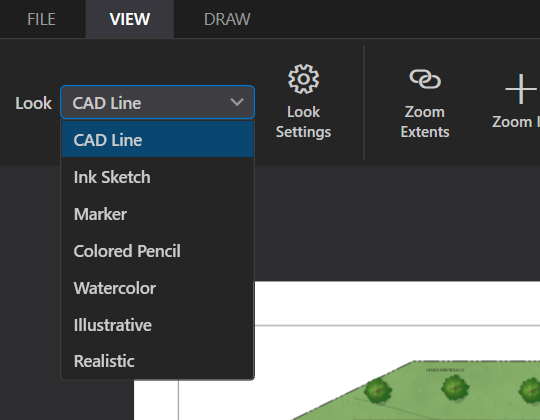
The Looks
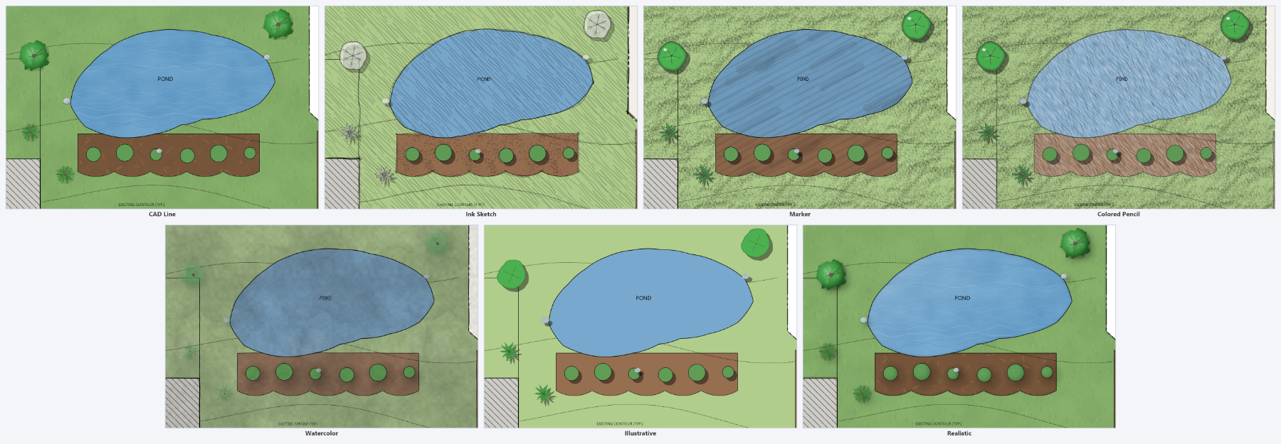
CAD Line
The default, and what every imported drawing starts as. Clean lines, no shadows and white paper reproduce the CAD sheet as it was. Materials still draw with the conventional hatches and library textures, so a plan tagged with materials is a fully rendered plan in CAD Line already; it differs from Realistic in line treatment and shadows rather than in fills.
Ink Sketch
Loose sketched linework with visible wobble and corner overshoot, on trace paper, with hard shadows. Materials draw as hand hatch, scribble and ink stipple. Symbols use the sketch family and lettering is a hand-printed face. The concept-plan look.
Marker
Confident ink linework with flat marker color laid in parallel chisel strokes, hard shadows, white paper. Where strokes overlap the color doubles, the way a second pass of the same marker does, so the streaks deepen the hue instead of greying it. Depth shading here is the second coat: every filled area carries a darker band of its own color along the shade side and a thinner, lighter coat toward the sun. Lawns, beds, paving and water are flat marker; loose plant masses (groundcover, meadow, bioretention) are scribbled in. The classic marker-over-ink plan rendering.
Colored Pencil
Grainy pencil linework on vellum, with every surface hatched in parallel pencil strokes at one angle and the paper showing between them, so lawns read pale and paving stays close to the sheet. Depth shading here is pressure: a pencil rendering goes over the shade side of every area again, pressing harder, so each surface and plant circle carries a wider light band and a narrower hard one of its own color along the side away from the sun. Trees and shrubs draw in the pencil symbol family: hatched color inside a scalloped pencil outline, shaded in two steps. Softer and quieter than Marker; good for planting plans and study sheets.
Watercolor
Ink lines with watercolor washes on watercolor paper, and soft-edged shadows. Each wash is a glaze of the fill color over itself, so where the pigment sits heavier the color goes deeper and richer rather than grey. Depth shading here is pooling: pigment gathers where a wash dries against its edge, so every filled area darkens toward its outline and bleeds a little past the line, and plant circles keep a thin, light heart. Trees and shrubs draw in the watercolor symbol family: layered washes under a loose pen outline and branch spokes. The most painterly of the looks.
Illustrative
Clean lines, flat color, hard shadows and no texture at all: a graphic, diagrammatic treatment for exhibits and presentation boards where flat color reads better than media. Symbols use the flat family.
Realistic
Clean lines with the material library's photographic tiles, soft shadows, and depth shading that gives surfaces and canopies form. The most literal of the looks.
Terrain Follows the Look
A Civil 3D surface's relief shading is a grey picture of the ground in CAD Line, Illustrative and Realistic. In the four hand-drawn looks it is drawn in the look's own medium instead, the way a hand rendering builds the shade of a bank: one coat over all the shaded ground, a second over the darker part and a third over the darkest, in the look's shadow color. Colored Pencil presses its strokes in indigo, Marker lays cool grey coats, Watercolor glazes grey washes that dry to a darker edge, and Ink Sketch hatches, then cross-hatches. Ground the light falls on stays paper. The terrain's opacity sets how strong the coats are, and a PDF keeps them as vector areas. See The Terrain tab.
Symbols Follow the Look
Trees and planting symbols exist in several drawn families: realistic, sketch, marker, watercolor and flat. Setting a look picks the family, so a block placed as an oak stays an oak and only its artwork changes. The library panel previews the current look's family too, so what you drag in matches what is already on the sheet. Where a symbol has no variant in the look's family, it falls back rather than disappearing.
Letting a Layer Opt Out
Some layers should never be stylized: the title block, a survey legend, a notes block. Select the layer and check Render as plain CAD on the Fill and Stroke tab, or use the same item on the layer's right-click menu.
That layer then draws with clean lines, no look shadows or depth shading, and its own lettering, while the rest of the sheet keeps the look. The paper tone and grain still apply to it.
Choosing One
FILE ▸ Style Gallery renders the open drawing in all seven looks onto one labeled sheet. It is much faster than cycling the picker, and it is the honest test, because a look that flatters one plan can flatten another.
Once you have picked one, Look Settings tunes it: line treatment, shadows and sun, depth, paper, grain and lettering, all with a live preview.
Getting the most out of looks
- Tag materials first. A look can only restyle surfaces it understands. An untagged, untextured shape stays a flat fill in every look.
- Leave textures at None where you want the look to decide. An explicit texture is honored everywhere, which is sometimes exactly wrong.
- Set the look before fine-tuning colors. Colors read differently over marker streaks than over flat fill.
- Keep one CAD Line export for the record set, and use the rendered look for the presentation set. Both come from the same project file.